Quantcast
Channel: Colorful Animation Expressions
Viewing all 122 articles
Browse latest View live

Red - Green: Varinia and Spartacus

$
0
0
Let us just stay with costume colors for a moment. Stanley Kubrick is widely known as a director who particularly pays attention to colors (especially in BARRY LYNDON, 1975, and THE SHINING, 1979). Although he inherited Kirk Douglas' production of SPARTACUS (1960) from Anthony Mann and the sword and sandal epic turned out to be the only film he didn't have power over the final cut, he nonetheless left his mark on the staging and filming of it.

Kubrick liked charging primary and secondary colors with meaning.
As we have seen in DR. NO (1962), efficient costume design can be very simple. Since SPARTACUS is about a slave uprising, I will not focus on the more exquisite Roman togae on display in the screenshot below. As Technicolor schemes were usually built around the appearance of the leading lady I will have a closer look at the costume colors of Spartacus' love interest Varinia (Jean Simmons).

In other words: I am focussing on the slave girl that almost blends in with the scenery since her working dress looks like it was made out of the same cloth as the curtains.
Crassus is obviously attracted to Varinia.
All the slaves are clad in earthly brown colors. Some of the gladiators are also seen in olive green hooded cloaks. Spartacus himself is one of them and for most of the story he is wearing his simple green gladiator cloak.
Green dominates Spartacus' environment. Does he represent vitality and nature?

Green is a very important color in most of Kubrick's films. This does not mean that there is one single specified meaning attached to it as Kubrick often developed a self-contained semiotic language within a given filmic universe. After all, Kubrick was keen on ambiguity so that each member of the audience could interpret what they see in their own way. Some may argue that this does not extend to SPARTACUS, a movie with very clear-cut heroes and villains and - very unusual for Kubrick - a sentimental love story subplot. Yet while the story may be clear-cut, the visuals are not.

Looking at the female lead there is a rather straightforward progression from blending in to standing out reflected in the colors of her costume.

Spartacus meets Varinia when she is given to him for pleasure and he refuses to behave like an animal in a cage. As long as she is Batiatus' (Peter Ustinov) house slave, she is merely part of her surroundings wearing a very desaturated salmon working garment.
Within a rather muted, earthly look there is a visible green - brown contrast.
Their next opportunity to touch each other comes when Varinia is feeding the gladiators. Again Spartacus wears his cloak.


Then we see Varinia serve Batiatus and his illustrious guests. In these scenes that show Varinia as a witness of the Romans' conversations she still blends in while clad in a more elegant dress.
Here, Batiatus' subordinate is wearing green. Finally, deep red is introduced as the recognizable color of Roman soldiers.
Varinia's role (of necessity, not choice) of passive spectator is reinforced during the gladiatorial combat that ends with Spartacus losing but Draba (Woody Strode) being killed.
Then after the fight, their costume colors are reversed - Kubrick liked mirror images throughout his career - and Varinia is seen in (Spartacus'?) green cloak at night.
Both shots (above and below) visually emphasize the iron bars that prevent Varinia and Spartacus from being free and together. Spartacus is seen in his working/training garment of the same color as Varinia's.

During the successful uprising, Varinia is forced to flee with Crassus. Now she is not trapped within the gates of Batiatus' farm any more. As the servant of an ambitious Roman politician she wears a pale red (salmon colored) cape/stole.

Finally, the lovers meet in the open at dusk. Now Spartacus blends in with the green environment. He seems to be at home here. Varinia's pale red dress made way for a darker but still desaturated purple dress.
Isn't it ironic that after so many gorgeous location shots almost all the love scenes that take place in "natural environments" are recreated on a soundstage and look so explicitly artificial that they do not fit in with the rest of the movie?
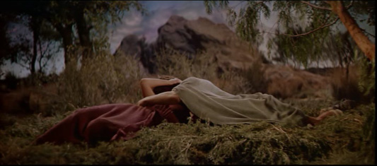
The lovers are getting intimate and Varinia is overwhelmed by Spartacus' green cloak:

The next time we see her, she is bathing in a whole pool of green water and not too unexpectedly she confesses to Spartacus that she is pregnant.
As Gen. Ripper in DR. STRANGELOVE says: "water is the source of all life". Maybe that is why virtually all love/sex scenes and implications in SPARTACUS are somehow connected to water. Just think of the famous "snails and oysters" pool scene.
She still wears the same dark purple dress, their relationship hasn't changed, she clearly stands out in the green environment. After she told Spartacus about the baby, he throws his cloak over her head and they visually become one.

Later, in a tent, there is hardly any distinction between their colors as everything is illuminated by torches.

After the final battle however, we have seen so many bodies and so many captives. Only after the famous "I am Spartacus" scene, Crassus sees a deep red cape that does not belong to a fallen Roman soldier.
This red cape does not belong to a Roman soldier...
Now Varinia - possibly to avoid showing blood as well - stands out in this strong red garment that matches Crassus' cape.
...but to Varinia and her newborn baby boy.
In the end, Batiatus and Gracchus manage to free Varinia and get her out of the city. She now wears a turquoise (light green-blue) cloak that may serve as a disguise but also connects her to Spartacus' cause. The green will live within her and their son.
Now, Varinia is in complementary contrast to the Roman soldier at the gates of the city.

As I have already written, there is certainly more to these colors. Not least of all their immediate affective impact on the viewer and (as is expected with a filmmaker of Kubrick's meticulousness) historical accuracy. But since SPARTACUS is Kubrick's least interesting feature, I will not dig deeper any time soon.

Dramatic Colors in a Mickey Mouse Cartoon (2/2)

$
0
0

With the current Mickey Mouse shorts revival on the horizon and the lighting orgy that is MONSTERS UNIVERSITY in theaters, this seems to be the right time to look at the colors of Mickey's last theatrical comeback in RUNAWAY BRAIN (1995). Unlike the most recent Mickey shorts, this was a production that showcased all the richness of full animation dressed up in lavish colors. Like in A TALE OF TWO KITTIES (Clampett, 1942) the lighting and mood of exterior scenes is heavily determined by changes of weather and time of day. 

Personally, I am not very fond of this short but it does showcase the extreme changes in color tastes between Disney's Golden Age and the late Renaissance period in the 1990s. Saturation seems to be much higher with character colors much more integrated into the overall image by what I call the "color cast treatment". Of course, this again only adapts live-action mainstream conventions of its time. Strong colors are not emphasized by earthly browns and greys so much as by less saturated versions of their own hue.

Instead of composing this post thematically, for once I will follow the storyline chronologically, merely providing captions to a sequence of very colorful screenshots.

Personality Change: Establishing the Theme
However garish this first exterior shot looks, it establishes the mood of the first scene with this green vs. violet-blue setting. Inside the house the cold blue tv screen is the only source of light and therefore the whole room is affected by its color. As we have seen in the first part of this color analysis, the hue of Mickey's skin had never been affected by lighting situations in the Technicolor days.
The brightest spots (faces and eyes) reflect the videogame coldness best. Even if we'd adjust the white balance to more or less neutral lighting conditions (the point of reference being Mickey's outfit and Pluto's fur), the background is still blue/green.
This is just a quick Photoshop estimation of white balance. Its high saturation is by no means accurate.
Obviously, it would not do to just take a warmly lit "normal" background with a blue overlay on top to achieve the strong blue cast on the walls.

As a side note: With Minnie digitally erased by Rob Richards of "Animation Backgrounds", we can see the whole pan background.

A-D: Minnie in shadow; E-H: Minnie in light.

We are used to shadows that look colder because they contain less warm light (normally reflections of blue sky or absence of direct sunlight). In this setup, Minnie in backlight is correctly depicted as warmer than when she is facing the cold blue light source. It is hard to believe that although both images look completely right, Minnie's red dress is actually slightly lighter in the shadow (D) than in the light (H). Light is just simulated by higher contrast within the character while the red is toned down because it is hardly reflecting the blue light.

Mickey and Minnie even have different skin tones (above).

When the TV is turned off, the background changes accordingly. Since it does not seem to be an objective change of lighting (Minnie turning on the living room lamps), the whole scheme is revealed as psychologically motivated or in other words: expressionist colors.
In the beginning (left), Mickey was dominant and we shared his experience. As a gamer his world was limited to himself and the TV screen. After Minnie has wakened him, the surroundings are more dominant (just compare the values of skin and wall in both pictures). Now we also see the "real" colors of the living room.

It is painted in a restraint triad that consists of less saturated versions of the characters dark yellow and red and is balanced by a turquoise-blue carpet. Skin tones are creamy and still slightly different
The contrast of yellow and blue is especially beautiful in this Pluto shot (below right):
The cast shadow on Pluto's head in this single shot makes the eyes stand out and feels absolutely right even though there are no such shadows in the other shots of this scene.

In the Monkey's Den
The same contrast of yellow/beige and blue is maintained but considerably less saturated when Mickey applies for the job that Pluto was "suggesting".

Before Mickey knows what is happening, he is finding himself in a contraption that looks like an electric chair under a huge laser cannon. The long shot establishes the cold blue metallic atmosphere. This seems to be the real color of this place and not just Mickey's expressionist take on it: His skin tone is hardly affected by the blue which probably just reflects from the water. This is the part of the film the mostly reminds me of the first Fleischer SUPERMAN cartoon.
All the special effects seem to be lit from unterneath in saturated colors. The surrounding water as well as the pink smoke look like light sources. Then when we see Pete emerging from the perspective of Mickey, he is all cast in red light.
When we see him from afar, the colors are more "realistic". I doubt that this objective vs. subjective thing was planned consciously here.
Above we have the first red vs. green complementary contrast.

Then Dr. Frankenollie turns on his machine and the room seems to get hotter until everything is dangerously red.
Only the bright blue lightnings provide constant contrast:
These violet-blue sparks are almost white and seem to cut the air.

After everything explodes the broken machine is cooling down again with only a faint glimmer of red from underneath. The room now seems predominantly violet (blue with a tinge of red) as opposed to the earlier blue that leant towards green.

Again the scary creature is illuminated from below like in a horror film. The bad Mickey has yellow eyes usually associated with cartoon predators.
Such cartoony deformations (right) would have been out of place in a Mickey cartoon of the Golden Age.
The Colors of Dusk
Then the bad Mickey (his brain not affected by a video game but exchanged with that of a brute) in search of Minnie climbs the building and emerges against a purple/salmon sunset.

The colors surrounding him are highly saturated. He just catches sight of Minnie entering a surfer's shop that is bathed in the last warm rays of a setting sun. Against the dominant yellow/beige and red, neon green objects stand out strongly. All the other beige bikinis disappear within their surroundings. Only the neon green really shines. To heighten the contrast Minnie even holds it in front of her dark red skirt.

Then, as usual, the monster is backlit, the dame in distress in full light.
As long as Mickey's personality is inside Pete's body, he is blue over all in contrast to hot Mickey and Minnie.

A low angle reveals that it is now almost dark. While the highest building still reflects the last ray of sunlight, the overall cast is dark purple.


After the brains are reversed again by an electric shock, the sun is finally down and the light has become expressionistically magenta. In the artificial light of the Hawaii billboard the characters are seen without a color cast but still a bit dark.

Pure Expressionist Colors
The final scene on top of the building starts out with realistic colors (grey buildings, no cast on Mickey) and suddenly turns into an expressionist fantasy while the camera flies towards Mickey.
Now everything is hot, even Mickey's outlines are not black but affected by the fierce red light. These next few shots showcase a variety of color schemes based on the characters' excitement and hot or desperate atmosphere:

The low angle of Pete's crushing fist breaks the red-yellow scheme and contrasts the fist with saturated blue. Then the reverse angle reveals a less red light source that brings back green.

The red and blue scheme of this second stage of the fight is clearly expressionist when compared to the objective version of the Hawaii sign from a few shots earlier against the same blue sky.
Now Mickey stands out against the blue - red background by his natural colors. (I like that shot very much). Is it possible that he is only affected by expressionistically colored light when he is raging with anger or fear?
Then the well-known "rope-around-the-giant" scene is taking us back to THE BRAVE LITTLE TAYLOR (1938).
And with the whole background fiercely red, Minnie stands out in cold fear (magenta looking like blue because of the red surroundings).
And Mickey is all red again. When he finally catches Minnie's hand, the two characters again have slightly different colors so that we can read the shapes of the intertwined hands more easily.
And as soon as fear and anger have gone, the character colors are back to normal while the expressionist backgrounds are replaced a shot later.
The lighting remains neutral...

...until the very end when the glowing sun affects the whole image.

Learning From History
While most films draw upon the contrast of warm (yellow) and cold (blue) colors, not many films dare to use red so excessively as a pure expressionist device. It is interesting that the level of expressionism does not extend beyond colors, there are no distorted shapes, not even real expressionist lighting with oversized, distorted shadows.

With its garish purples and saturated reds and blues it is closer to POCAHONTAS (released that very same year) than to Mickey cartoons of around 1940 from which it borrows the protagonists' designs.

I may well have grown accustomed to such saturated color excesses, but I still do not feel comfortable with them any more than in 1995. But in hindsight this kind of experimenting within mainstream animation has probably only enabled artists to develop such masterpieces of illumination like TOY STORY 3 or MONSTERS UNIVERSITY (unfortunately not a masterpiece of storytelling or originality).

And last but not least, it is easier to understand underlying principles in extreme examples of color design. Whatever one takes away from studying these films should by no means prevent them from incorporating these ideas into more subtle color schemes.

Children's Book Illustrations

$
0
0
Over the past year I have been illustrating a collection of short stories for pre-school children by a local author. For each of the 13 stories I made one picture that should get children interested in the story but not give away any twists or punchlines. Last weekend the book was finally released in a very short run which gives me a pretext to post some of my own work here for a change:


All pictures: pencil and watercolor on grained paper, colors in photoshop.

Bob Clampett: Black Cats in Technicolor (3/3)

$
0
0
Near the end of his career at Warner Brothers Bob Clampett confronted Porky with four hostile felines in one of his most garish and shrill cartoons. In this third and last installment of "Black Cats in Technicolor" I focus on layout and lighting experiments. A closer look at KITTY KORNERED (made in 1945, released 1946) reveals surprisingly restraint color palettes behind the crowded and ugly compositions.


The cartoon starts out fairly common with a blue winter night setting contrasted by spots of yellow. This has already been established in the title sequence.

Basically, yellow stands for artificial light within the houses. It also highlights the clock on the church tower that corresponds to the narrator's claim that the cats are put out at nine o'clock every night.

As can be seen in this desaturated version of the pan contrast and sculpting on the buildings is mostly achieved by hue instead of value. The walls facing the camera are all blue because they are in the shadow which is indicated by the cast shadows on the snow. The object colors are indicated on the side walls of the buildings. When robbed of the hue it is harder to see which walls are in the shadow (see especially the reddish house, second from right).

Likewise, the clock does not stand out from the tower when robbed of its hue (yellow).

Within seconds red and green are also introduced. On the traditional color wheel green lies between primary colors blue and yellow and fits well into the overall scheme.

It is probably no coincidence that Porky wears dark red in the title card (top image). In the actual film, an extra wears that color while Porky himself is in his white pijamas.


Fully saturated
All of these "black cat" Clampett cartoons stage colorless characters against colorful backgrounds. THE HEP CAT (1942) applied a tastefully muted night time palette with spots of primary colors. In A TALE OF TWO KITTIES (1942) the colors have been determined by different times of day and thus consisted of natural earth tones and strong sky colors rooted in reality.


The choice of garish neon colors in KITTY KORNERED, however, takes the concept of colorless characters against colorful backgrounds one step further. Gone are most of the earth tones. Flamboyant hues prevent the backgrounds from receding and feel much more expressionist than realist. The room colors also seem to change occasionally for no other reason than variety.
The characters however are even less colorful than before. Skin tones are limited to the "human" pig Porky. Details like eyes and noses are fully saturated. [Note: Part of this is probably due to digital restoration, but judging from the overall appearance the image might not have been that bright on film but fully saturated with even more contrast.]

Lighting experiments
Porky's house is in keeping with the already established blue-yellow color scheme with blue leaning towards green (the fence) and towards red (blinds and right walls).

In the close-up that follows the glass-less window is not illuminated by yellow artificial light. Instead we can see that the wall inside is green. Porky and the cats' tails are in strong silhouette that looks great but is not consistent with the rest of the frame image.
All the silhouettes in the film coincidentally read against a green background. The most expressionist (non-realist) version is in the one where the cats' eyes are even visible in silhouette.

The threshold between exterior and interior color scheme is rendered rather expensively: On the outside the door is seemingly white and therefore reflects the light of its surroundings. When it is opened the inside lighting affects it strongly. Since any gradient from blue to yellow (reflecting artificial light and yellow walls) includes green in the middle, the door changes gradually on each frame from light blue to green to yellow.
Background perspective is already a little forced, the closed door however is wonky and outright wrong!
Looking at the single frames the supposed lighting effect does not seem natural because the colors - especially neon green - are far too heightened. As an experiment of integrating inside light sources and connecting the exterior and interior by its common denominator (green), this very brief effect is an astonishing experiment.Of course, it could have all been achieved by simply having a door that is green inside and outside. But the saturated color change adds a lot to the impact of opening or closing this door (as can be seen below).
It is typical of Clampett's way of rushing through productions that a lot of energy is devoted to slamming the door but the lighting on the snow does not change and we still see Porky in the pool of light created by an open door when he hammers against the close door.
Again opening the door results in a harsh change from a monochrome background to a momentarily gaudy one:

Expressionist perspective experiments
The rest of the "pig and cats" games take place inside Porky's house. Analyzing the following screenshots I will focus 1) on the warped perspective and 2) on the different color schemes of the four chase scenes.

Before Porky enters the house through a pane-less window, Clampett overstrains us with a cluttered composition of all four cats without visual hierarchy. As if this wasn't enough, the room seems to lean towards the spectator. The background colors look random (probably because of the dominant lavender-blue drapes). Upon closer inspection the underlying color scheme seems to be magenta (wall and floor) vs green (couch). Size relations vary a lot in Clampett's expressionistic cartoons as can be seen when Porky's oversized head enter the frame from behind the cats.
While all the other backgrounds of this scene adhere to the magenta-green contrast, there is a glitch in the beginning when the smallest cat jumps into the "old-man" jug (blue walls).

Green and magenta
In this strange bedroom the the floor is green and polished:

Perspective on the wall is wonky and supports the pan to the right with vertical lines leaning to the right.

Here the background perspective is from slightly above while the cat is seen from the side.
In the room where the alcoholic cat is hiding the colors are reversed. But even in the fishbowl, the magenta-green contrast is maintained.

Green and blue
Just in case you thought that room colors were consistent in order to garantuee orientation, think again... As soon as Porky arrives on the scene, the floor has changed from green to dark blue and from polished to carpet.
Probably the higher angle on the left was chosen to not give away the green walls just yet - to make the change more gradual.
Again the perspective of background and character in motion are inconsistent. After the cut, however, there is a relatively flat pan that ends in a tilt wall:
To emphasize the tension of dragging cat and mice across the room, we cut to a visually elongated room (below left) and then to a tight corner that once again features characters that are aligned straight in front of a tilt (or wonky) wall.
The camera again pans several times across a geometrically flat background that completes the triad of neon green, dark blue and purple.
It does not matter whether these are the same rooms we have seen before. And it does not matter that the lighting effect only applies to the shadow dog and nothing else in the picture, either. With all the garish green and expressionistic changes of color schemes, this cartoon seems to scream: I am hysterical and I am eager to inflict the same on you!

Red, yellow and neon green
Interestingly, the doorway colors are indeed consistent with the beginning of the film: red floor, yellow walls, green door.
Although perspective is warped in every background, the angles seem to be chosen carefully. Once again the characters are consistently seen from the side while the entrance area is seen from a different angle. Skew vertical lines support the dynamics of anticipation and jump.
John Kricfalusi has analyzed this scene in great detail and has been pointing out the following cut on action (or rather impact):
"right in the middle of the action Clampett changes the background to the more extreme angle of the door.
This gives the crash way more impact than if he had done the logical thing and used the same background." (John K.)

In my opinion this cut not only gives the crash more impact but is completely necessary for two reasons: 1) the mismatching character and background angles of the jump could not result in a convincingly drawn crash. 2) After the crash, the cat's fall is limited by the frame. Although its lying position is by no means consistent with the angle of the crash, at least this background makes it look like the cat was lying on the floor. This landing on the edge of the frame would be completely off in the first high angle background.

Both backgrounds are wonky but not in the same way. Note also that Porky still seems to stand in the last scene (or in an upstairs room?).
Pink and green, magenta and yellow
Then after the cats have conspired to disguise themselves and play an "Orson Welles" (re-imagining his famous "War of the Worlds" radio drama) on Porky, we see Porky's bedroom that combines purple walls with a green blanket and a dark blue floor.

The "martian" characters are depicted in fully saturated colors. Two in hot pink and green and two in magenta and yellow.

Porky's take is once again limited by the upper frame edge.
When Porky runs upstairs to get the gun, the wall behind him is blue. During the following showdown the staircase however combines a magenta carpet with slightly muted yellow walls. As can be seen above (Porky's take and blanket in the air) and below, Clampett (or his layout person) often cuts from low-angle to high-angle shots in this dramatic final confrontation.

Perspective is increasingly forced in order to make the distance between the opponents seem huge.

Upstairs the floor and walls look like in Porky's bathroom. For dramatic reasons the outside lighting conditions are reversed when Porky runs towards the window...
...and are finally back to the beginning with a pool of light that is completely inconsistent with the window Porky just jumped out of. Dramatically the glowing red behind the victorious cats feels right although the walls behind them has been shown to be of a different color just seconds before.

Inconsistent by nature
If this cartoon proves anything then it is the fact that inconsistent backgrounds are not consciously noticed as long as the audience is busy following the foreground action. If even a loose continuity of character action is maintained, film makers can get away with almost anything in the background (many a movie trailer makes good use of this effect). There is no doubt however, that perspective and colors subconsciously have a strong effect on how we perceive the action.

In most of these backgrounds there is nothing receding and no muted tones the eye can rest on. Instead the colors seem to jump forward adding to the claustrophobic feeling of this cat-infested house.

I am sure that many inconsistencies in Clampett's cartoons could have been avoided by handling these scenes more carefully. But that, it seems, was not what Clampett was after. He wanted to entertain and also see what he could get away with.

Whoever chose those colors could have gone completely random. But as my breakdown into scenes has proven, they did not. Some of the dominant colors may look unpleasant but they have been applied very restrictively within clearly defined color palettes. There seems to be a long way from the subtle color effects of THE HEP CAT to the outrageous color design of KITTY KORNERED. As you may have guessed I favor the earlier approach. But I also like to study artistic growth and that is what these three posts have been about.

One-Shot: The Kite Runner (2007)

$
0
0

Years after seeing Marc Forster's adaptation of THE KITE RUNNER I mostly remembered the costume colors. So when I revisited it last week in the course of studying Forster's personal film making style I still found the colors to be most attractive. Considering that they are based on the now well-worn drama cliché of blue against sandy brown this is saying a lot. There is so much variation throughout the film that I cannot possibly do justice to the color design in this short "one-shot" post. But since Marc Forster is very deliberate and particular when it comes to colors in his films I would like to highlight two facets that I liked in THE KITE RUNNER.

From two-colored present America back to three-colored Afghanistan
Having just received the specimen copies of his first novel, Amir (Khalid Abdalla) gets a phone call at home that triggers memories of his youth in Kabul. Both he and his wife wear dark blue clothes against more or less monochrome sandy colored surroundings.
When one of his late father's friends calls, a flashback to Amir's happy childhood days in Kabul sets in. At first the color scheme is basically the same but the blue is more vivid, less repressed.
Then suddenly a second kite brings orange and green into the frame. The lighting seems naturally golden. Then we see a young boy whose clothes are orange, blue and sandy brown.
These are no doubt the quintessential 1970s colors (a title overlay states the year 1978). And although this story is set in an Oriental desert, we soon learn that the Afghans are indeed influenced by American fashion (movies and cars).
Young Amir's (Zekeria Ebrahimi) best friend Hassan (Ahmad Khan Mahmoodzada) is clad in blue in this expository scene of their close friendship and interdependency.

Soon we meet Amir's Baba (Homayoun Ershadi) and his best friend Rahim Khan (Shaun Toub). Rahim's orange shirt and tie against a gray suit, by the way, was the color scheme that I remembered most vividly:
Although the apartment looks very warm and golden, DOP Roberto Schaefer managed to keep the gray suits from looking muddy. It is this slight contrast of gray against sandy brown that makes this color scheme stand out from the many sepia toned, nostalgically warm stereotypes I have seen over the year (just think of interior scene in any recent Woody Allen film). In many ways, it is equal to the color design of FANTASTIC MR. FOX which is also reminiscent of the 1970s.
Marc Forster's scenes are usually very tightly composed in matters of color design but not as obviously flashy as in Jerry Bruckheimer or James Cameron movies.

[Note: Later on in present Pakistan the overall color scheme is still based on sand and blue but feels a lot colder.]

Green stands out
The one color that seems to have a special significance to Marc Forster is green (J.M.Barrie's apartment and the park in FINDING NEVERLAND, 2004; the fatal green apple in STRANGER THAN FICTION, 2006). I have found it to be very deliberately used in all of his features except QUANTUM OF SOLACE (2008) (although Forster mentions a green door in an interview), where at least the villain was named Dominic Greene.

I have not yet found out if there is a recurring symbolic meaning to it or if Forster uses it in a new context in every film. In THE KITE RUNNER, Amir stand on green Californian meadows in the beginning and end, but in Afghanistan (and later Pakistan) there is hardly a green piece of cloth except in two connected scenes.

After Amir has abandoned Hassan he schemes how to get rid of his too loyal friend. During the preparation for his birthday party he asks his father to send Hassan's father away. Soon after he comes up with a more effective plan to betray Hassan. He lies to Baba - who now wears a green jersey - telling him that Hassan has stolen Amir's watch.
Amir's plan works out when Hassan loyally takes the blame on and his father decides to leave for good.

I have yet to look at the film more closely to see if there is another instance of Amir or his father wearing green and if there is a connection to Amir's betrayal that serves as his narrative backstory wound that motivates the film.

Bob Clampett: Heighten The Impact

$
0
0

The easiest way to heighten the impact of a punch is adding a stronger sound effect to it. In silent comedies editors often cut out a few frames before the impact or substituted the frame that shows the actual contact by a white frame (or left it out altogether). These techniques are still quite common in character animation these days (see Preston Blair or Richard Williams on the elongated inbetween).

However, playful film makers have been experimenting with more campy (or obvious) effects, especially in cartoons or trash action movies. In the opening sequence of MACHETE (2010), for example, Robert Rodriguez heightened the many blows delivered by Machete (Danny Trejo) by either adding fake projector issues (the scene in question is too gory to present here) or shaking the whole frame (adding to zoomed in frames) when the door hits the bad guy as you can see in the animated gif below:

In Clampett's films extreme distortions and inflating body parts in the moment of impact are fairly common. In BABY BOTTLENECK (1945/46) the rubbery transformations are supported by written letters and color changes. This cartoon is a prime example of how Clampett incorporated so many characteristics of silent rubber hose cartoons that have been lost during Disney's quest for realism.
The warning letters above are jumping out of the panel.

Below, Clampett has added the word "BOOM" which is completely redundant in a sound film but reminds the audience of the cartoon's origins in comic strips.

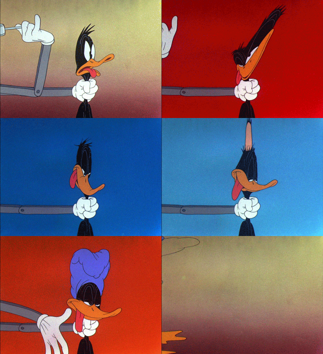
In his Danny Kaye parody BOOK REVUE (1945/46), Clampett has already been messing around with color changes to heighten the impact of an accent. On the word "Cucaracha" the whole background behind Daffy is exchanged for a flamboyantly red color card. This momentary dive into fantasy sets is a staple of musical comedies. Once again, Clampett uses the lower frame edge as an imaginary floor. But in contrast to what we have seen in KITTY KORNERED, perspective is strongly indicated by the animation alone.


In BOOK REVUE the backgrounds are as sparse as can be, often just gradients without any other detail than grain. Expressionistic color changes are not part of a musical parody but emphasize the impact of a hammer blow. But the colors do not cease to change. Instead they seem to reflect Daffy's mental state after being hit. The following panel of screenshots illustrates the succession of colors:
In this slowed down animated GIF one can see that each color is held for a different amount of frames.


First Shots: The Dollars Trilogy

$
0
0
A short analysis of what Sergio Leone's first shots in each of his three Eastwood movies reveal about the films they open. The scenes that follow these shots have already been analyzed to death, so here I just try to squeeze out as much information from these first one or two shots about the films and Leone's developing style of storytelling.

Opening scenes or first pages are usually some of the most interesting parts of movies or books. Especially upon second viewing/reading, expository scenes reveal a lot of information to prime us for a narrative's main themes and characters. Most often, they basically contain the central conflict of the story.

Sergio Leone - like Kurosawa whose YOJIMBO (1961) he shamelessly remade as A FISTFUL OF DOLLARS in 1964 - was fond of very long takes and elaborate tracking shots which he contrasted with frenetic cutting in action scenes. 

The Triangular Composition
After a rotoscoped credits sequence, his first Italian western fades in on a low angle shot of rocky desert sand. Before we see the "man with no name" (actually called "Joe" in this one), we see the hooves of his mule. The small size of the animal is immediately recognized because the rider's feet are dangling very close to the ground.

When zoom lenses became widely available in the 1960s, the practice of opening a scene on a detail followed by zooming out to the actual establishing shot came into fashion. Classical Hollywood producers preferred to open on an establishing shot and then cut ever closer to the actors. Of course, Sergio Leone was by no means the first director to reverse this practice - he might have lifted it from Kurosawa as well. In contrast to numerous Italian westerns of the era, however, Leone resisted the obvious zoom-effects and relied mostly on elaborate dolly and crane shots.

The camera then pans up and slowly trucks in to reveal the back of a man wearing a poncho. Remember, this is Clint Eastwood's first appearance in Italy and his first in a theatrical western at all. And at that time, nobody expected the star to be stubbly and dirty. This first shot continues until the following composition is achieved:

The basic conflict is visualized in this single composition: two warring parties live across the road from each other, Eastwood "smack in the middle" checking them out before playing them off against each other. Him standing closer to the right house may be simply a matter of balancing the composition. However, we will eventually learn that morally he is closer to the people living in the right house.

In form and content, all three films are based on triangles. Aside from the visual triangle that is formed between the two houses and Eastwood (and his mule), the well is also constructed in a triangular shape.

Then Leone cuts to a reverse medium close-up of Eastwood drinking and observing. I will not go into any more detail about the rest of the opening scene that basically sets up the iconic "man with no name" as a stoic western version of Mifune's unkempt animal-like YOJIMBO character Sanjuro.


The Man With A Rifle
Moving on to the very first shot of FOR A FEW DOLLARS MORE (1965), we can see how Leone started to get more confident with the vast widescreen of the Techniscope frame (a non-anamorphic grainy version of Cinemascope).

After a title card reading "Where life had no value, death sometimes had its price. That is why the bounty killers appeared." the film opens on a blinking point of light that is reminiscent of the white burnout at the end of the first films credit sequence:


But upon closer examination, this blinking point guides our attention to the only spot of interest in the otherwise empty long shot of a gritty desert location. We already look at the middle of the frame when a far off rider appears during the dissolve.


Supported by the artificial representation of spatial acoustics on Italian soundtracks, the whistling and gun loading may very well emanate from the rider in the distance. In fact, even in 35mm the grain will not allow the audience to read the silhouette clearly. It is not even clear if the rider in the distance sits on a horse or a mule.
These compositions are obviously made for theatrical exhibition and not for cellphone screens.

From all we know from the first film and the posters, this might be Clint Eastwood approaching. But then (0:55) the sound is clearly located offscreen since we see smoke and hear a gunshot after which the rider falls off in the distance. But who are these two people? To make matters worse (in a film that first came out with all the voices dubbed by Italian actors), the offscreen humming and whistling was reportedly done by Sergio Leone himself.

This rigid long take sets up several key aspects of the following film: we shared the point of view of a sniper. In a traditional western this must be the villain because no honorable western hero ambushes another man. But with this film Leone introduced the bounty killer as a professional and thus motivated a whole sub-genre of bounty hunter westerns.

From the whistling it becomes clear how emotionless the bounty-hunting business is executed. We also see an action while the director withholds vital information to the scene - in this case the identity of killer and victim. Of course, everybody knew from the advertisements, that this time Eastwood was supposed to be meeting his match in the person of a man in black. With FOR A FEW DOLLARS MORE Leone introduced his fragmented flashback technique that was unheard of in western storytelling.

The cynic key to successful bounty-hunting lies in the choice of weapons as Lee Van Cleef's character Col. Mortimer proves a line of dialogue from FISTFUL OF DOLLARS: "When a man with a .45 meets a man with a rifle, you said, the man with a pistol's a dead man"
Mortimer usually kills with a long-range rifle just from outside his opponents shooting radius.


Going The Distance
By the time he did his internationally funded masterpiece THE GOOD, THE BAD AND THE UGLY (1966), Leone had perfected his directing style to the point where he was able to successfully defy all conventions, be they visual or content-wise.

Ever since FISTFUL OF DOLLARS it has become one of his trademarks to cut from extreme long shots to close-ups without cushioning medium range shots inbetween. The camera framed the actors' faces increasingly closer until there was barely more to see than the actors' eyes (the now famous "Italian shot").

THE GOOD, THE BAD AND THE UGLY was again based on the concept of three (visual triangles galore) but also on the concept of surprise. There is hardly a scene that is no built around a surprise revelation. Moreover, the concept of withholding information is not only central to the narrative, it is also central to the visual realization. This leads to a highly stylized setting that does not extend beyond the frame edges.

Even the few suspense scenes (the natural opposite of surprises) turn out to be achieved by a visual trick that is revealed in a surprise ending.

So with these two concepts (juxtaposing extremes and withholding information) in mind, the first two shots of THE GOOD, THE BAD AND THE UGLY constitute one of my favorite opening scenes:

Again the empty long shot. But before we are able to find something interesting in the distance, Leone surprises us with an extreme closeup of a face (the startling effect on a scope cinema screen cannot even be guessed from this micro representation here). But he is not cutting from extreme long shot to extreme close-up; he is doing it within the same shot! Two hours later we will understand why it is crucial that this particular face (Al Mulloch) is imprinted in our memory.

Then we get the reverse shot. We share the point of view of this gnarly character. Now the searching for information begins. What is he looking at?
Is it the dog that crosses the plain? (The dog appears again hours later to momentarily consternate a frenetic Tuco).

No, there are two specs approaching from the distance. Leone cuts back to Al Mulloch, then back to the approaching silhouettes on horsebacks. Will they have a stand-off? Will he shoot the two with a rifle? We haven't seen anything else than his face, so he might as well carry a long-range rifle.

Of course, the situation turns out to be a wholly different one.

After opening ONCE UPON A TIME IN THE WEST with a few short close-ups, Leone came back to the FISTFUL OF DOLLARS approach in his Mexican revolution western GIU LA TESTA (DUCK YOU SUCKER, 1971) with a long take that fades in on a close-up followed by a tracking shot into the establishing composition.

Note: all screenshot and excerpts from THE GOOD, THE BAD AND THE UGLY have been taken from the impeccable Italian restoration (IL BUONO, IL BRUTTO, IL CATTIVO) (un)available on Blu ray which is visually far superior to the American one but unfortunately does not contain the English language soundtrack.

Miyazaki's homage to an imperturbable St. Bernard

$
0
0

Now that Miyazaki's retirement plans seem to be more definite than ever (unlike the three times before), it is a good point in time to dig deeper into what made his storytelling so different from mainstream animated features and yet so universally appealing.

His 1989 children's book adaptation KIKI'S DELIVERY SERVICE is a film that grows on me everytime I see it. Recently I have started to compare it to another blockbuster that came out in 1989: THE LITTLE MERMAID (Clements/Musker). As soon as I have figured out how to organize my thoughts and analyses, I will write a series of articles about these two films. But more on that later.

For the moment, I would like to guide your attention to a significantly more superficial observation that always makes me smile: The imperturbable St. Bernard.

If you have ever seen Takahata's ARUPUSU NO SHOJO HAIJI (HEIDI - GIRL OF THE ALPS, 1974) you will remember the grandfather's sleepy St. Bernard called Josef (or "Josefu" in Japanese). In the beginning the five year old girl does not know what to make of him as you can see in the following clip from episode 2:
I have chosen this clip because Josef's musical leitmotif (more like a fully rendered theme) is heard for the first time. To me, the dog's character is as much defined by this lumbering tune as it is by his cumbersume and phlegmatic appearance.

In episode 4, after it is implied that Josef is naturally chasing birds, he unexpectedly saves Heidi's pet bird Pitchi:

St. Bernards used to be called "Saint Dogs" because they were traditionally used for Alpine rescues and often depicted with a barrel of brandy around their necks in contemporary paintings. It is therefore only natural for Josef to be in the life-saving business as well.

Most often however, we see him dozing somewhere (see below).
St. Bernard Josef does not seem to be attentive but never misses anything that goes on around him.
15 years later, Miyazaki pays homage to Josef in KIKI'S DELIVERY SERVICE: Kiki's sidekick Jiji is forced to substitute for a stuffed cat that Kiki lost on the way to a boy called Ketto. Now Ketto not only has a pet bird that goes by the name of Pitchi, there is a sleepy family dog as well. Of course, the black cat Jiji is instantly afraid to be alone with the large dog. But Ketto's dog does not seem to be interested in following its instincts to chase the cat.
Ketto's family dog in KIKI'S DELIVERY SERVICE shares most of Josef's characteristics.
Although this dog is drawn much more realistically and does not really look like a St. Bernard, it shares most of Josef's characteristics in personality and appearance. Joe Hisaishi even paraphrases the recurring musical theme albeit more sophisticated as you can hear in the following montage of the three dog scenes:
Josef's reincarnation finally (1:11) saves the heroine's pet in a similar way. Here, however, it is not played for suspense but for laconic humor that derives from the dog's imperturbable motion.


First Shots: YOJIMBO (1961)

$
0
0
In a recent post about the first shots of Leone's "Dollar" films I have hinted at his great indebtitude to YOJIMBO. As an addendum (and advertisement), here is the first shot of Kurosawa's great samurai farce.

YOJIMBO is photographed by Japan's greatest cinematographer Kazuo Miyagawa and it certainly ranks among Kurosawa's strongest widescreen efforts. Although mostly obscured by white title characters, the single two and a half minute shot that opens the film draws us into the world of the samurai with no name (he only adopts "Sanjuro (thirty) Kuwabatake (mulberry field)" when he sees a mulberry field outside the window) so memorably played by Toshiro Mifune.
The shot opens on a mountain landscape that is largely obscured when Mifune enters the frame from the right. One could say that he blocks the camera's view and we only see his back for much of the shot. His standing in our way is a nice way of preparing us for a story that is entirely told from his point of view.

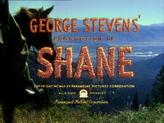
It is no secret that Kurosawa was inspired by American westerns, especially those by John Ford and George Stevens. So it comes as no surprise that Mifune is entering the frame in a similar way to the protagonist of SHANE (1953):


At about 12 seconds in, the samurai's mannerisms are introduced: he often arranges his shoulders and scratches his stubbled chin and unkempt hair. And even from behind we can tell that he keeps his hands under his clothes.

When he starts to walk to the left at 21 seconds, the camera follows his every move, keeping him tightly framed within the scope frame which in this film emphasizes narrowness instead of opening up the screen. We do not really see Mifune's face yet because it is still turned towards the mountains.

We follow the silhouette of his head until the camera pans down at 1:40 until we only see his feet and the ground he walks on (passing a few stone idols). 20 seconds later, a camera pan up his body ends up in a horizontal composition not unlike the first one with Mifune still walking until he reaches the visual center and is visible from head to toe. He then throws up a stick to figure out which way to go.

The last minute up until he picks up the stick are paraphrased by Leone in the first shot of FISTFUL OF DOLLARS (1964). Moreover, his unexpected opening of THE GOOD, THE BAD AND THE UGLY (1966) could be traced to the opening of the shot. In both cases we first see a distant mountain landscape. In both cases a character moves into the frame at very close range. Leone, however, makes sure that Al Mulloch's face is imprinted on our minds while Kurosawa draws the attention towards the character's behavioral pattern.

Screening Advertisement
On the 23rd of September I am introducingtrigon-film's digitally restored print of YOJIMBO at the cinema Gotthard in Zug (Switzerland). The screening will be followed by a 20 minute lecture on how Sergio Leone transformed Kurosawa's masterpiece into his first catholic Italian western.
Mirror images: Mifune enters from the right (top) as Eastwood enters from the left (below).


There is certainly more to Leone's adaptation than re-arranged widescreen compositions.

The Sound of the Samurai

$
0
0
Donald Richie calls YOJIMBO (1961) "the best-filmed of any of Kurosawa's pictures". But the sound track is worth studying as well. I have compiled two videos that demonstrate the interaction of sounds and music.

Even though Japanese sound tracks at the time often suffered from fidelity issues, Kurosawa was very conscious of the power of sound design (a term that was yet to be invented). In YOJIMBO there are several percussive sounds that fulfill important narrative functions:

In the beginning, when Sanjuro meets the angry farmer and his son in a tele-photo close-up, the only indication that there is some sign of civilisation around are the steadily repetitive sounds of a hand loom. Kazuo Miyagawa's camera then follows the farmer to the nearby house where his wife is weaving equanimously. This rhythmic sound is accompanying the whole scene (which I have shortened) and gets across the subtext that this is a monotonous life.

Later, the inn-keeper Gon tells Sanjuro about all the people in the village. Some of them are introduced by sounds: We only meet the coffin maker by the sound of his hammer which annoys Gon considerably. The sake brewer who rarely leaves his home is characterized by the drumming of his prayers.

Finally, the town crier Hansuke announces the time by beating two xylophone-like sticks. You can hear all four of these sounds in the clip below:

Masaru Satô picks up many of these sounds in his jaunty and rumbling score. Reportedly, Kurosawa did not want a chambara score in any conventional sense and asked for music in a voodoo idiom.

Satô, a composer who liked to incorporate western popular music and jazz in his film scores, wanted to pay homage to Henry Mancini. Miles away from the lightness of "Moon River" or "Meglio sta sera", his succession of short cues was most likely inspired by Mancini's score for Orson Welles' film noir TOUCH OF EVIL (1958). Given that YOJIMBO is partially based on film noir characters, this assumption is not so farfetched.

In the following clip I have juxtaposed excerpts from both soundtracks:
1. "White Horse Lodge" (YOJIMBO): Here the percussive sounds are easily recognizable within the music
2. "Main Title" (TOUCH OF EVIL): There are similar percussion patterns and low brass and woodwinds.
3. "Ronin Arrives" (YOJIMBO): This is a good example of another characteristic trait that might have been influenced by TOUCH OF EVIL - melodic lines arranged in a very low register throughout.

THE LITTLE MERMAID: Circles

$
0
0
Today marks the release of THE LITTLE MERMAID (1989) on blu ray. It is renowned for being the first film (in the wake of ROGER RABBIT's success) of the 1990s "Disney Renaissance" under the reign of Jeffrey Katzenberg and Peter Schneider. Much has been written about it in the last 24 years concerning Disney's return to fairy tales, the film's imprudent reinforcement of antiquated femininity conceptions, and its role as a precursor of the 1990s teenage love story formula that led to the demise of hand-drawn animated blockbusters.

In this post I will examine the graphic shape of the circle as a design element and a recurring motif for Ariel's longing throughout the film.

THE LITTLE MERMAID introduces us to two worlds that are separated by the surface of the sea. The one above - our world - is mainly ignorant or uninterested in the world underneath except when it comes to seafood. Those below are ordered to stay away from humans altogether by well-meaning but narrow-minded patriarch King Triton.

Circles of Hope: Above the Surface
Triton's youngest daughter Ariel, however, is an energetic and free-spirited teenager of 16 years who is desperate to learn more about these humans and is glimpsing into the sun whenever possible. From underneath, the ocean surface is made visible by the round reflection of the sun. This image is introduced less than three minutes into the film during the credits sequence.
The circle that represents the sun is used as a symbol of Ariel's longing in the first half of the movie. In addition to that, circular (and oval) shapes are omnipresent in the design of the underwater world from the serpentine skeleton of Triton's palace to Sebastian's performing stages.

The circular shape is also emphasized when it comes to holes for characters to peek or swim through, especially portholes in the form of a bull's-eye. Ariel enters a ship wreck through one which Flounder gets stuck in. The pay-off to this plant is happening within the same scene as is common in children's films: Flounder is luring the shark to swim through an iron hole so narrow that they can trap him. Later, the seagull Scuttle (what an apt name) witnesses a crucial revelation by peering through a bull's-eye of a ship not yet wrecked.
Ariel's secret treasury is combining the hole with the sun reflection and communicates her single-mindedness perfectly in the form of a tapered tube directed towards the sun of the human world. It may be a coincidence that this setting is evocative of Scuttle's telescope earlier in the movie, the effect is definitely the same.


Then, with all attention guided towards the circle of light, it is obscured by the silhouette of a large ship. Ariel meets Prince Eric and a storm is wrecking the ship.

During the dramatic rescuing sequence, circular shapes and forms are emphasized in the special effects design. When Eric finally catches a glimpse of his saviour he as well is staring into the sun which looks like a halo above Ariel's head.
So after this moment, Sebastian is unable to convince Ariel to stay within the boundaries of her father's realm, no matter how many circular bubbles and sun-like blow fish he produces.

Ariel has already been lured into selling her soul to the devil.

Circles of Evil: Transformation
Little more than ten minutes into the film, we have already met the villain's sidekicks/spies Flotsam and Jetsam whose combined magic eyes transmit video images to Ursula's crystal ball.
It is certainly no coincidence that the extremely reclusive Ursula (allegedly since having been overthrown by Triton) is dwelling inside a snail shell at the end of a long tubular corridor (actually a fish carcass). Here, in her innermost sanctuary, concepts of female behavior are contrasted and discussed.


left: Ursula likes to move her tentacles in circular ways.
And in this fortune teller's tent full of circular shapes we are about to find out that Ariel's voice itself is a ball of light not unlike a small sun. Or in other words: to be able to live in the sunlight above, she has to trade in the sun of her own personality. As teenagers often do, she is letting herself be talked into trading the one thing that both defined her as a person and let her express her views and feelings. From here, the story could have taken a different turn towards many interesting confrontations and conclusions.

Circles of Time: The Countdown
There is another catch to this tranformation - one that is much more crucial to the way Musker, Clements and Ashman are telling the story here: If Ariel does not win the love of Eric within three days' time, she will retransform and remain a mermaid forever.
So early on, the full moon and the sun are introduced prominently as timekeepers. A countdown is only generating suspense when every member of the audience is aware of how much time has passed and how much is still left. While it is viable to periodically show a digital watch in modern thriller, a historically themed children's movie must rely on devices like moonlight and sunsets to indicate the time of day. In THE LITTLE MERMAID, both moon and sun are always large and dominant.

In the final act, the importance of these circles for the countdown are emphasized by match-cuts from Ursula's circular snail shell amulet that contains Ariel's circular singing voice.
Ursula's transformation reflects the halo around Ariel's head when Eric first saw her.
This match cut is emphasized by a dissolve.

The sun that is Ariel's voice.
Another match cut without a dissolve: the connection between the bargain and the third sundown is stressed.
The sun is in every shot.

Since the "funny animals" part of the showdown is not going to give Ariel enough time to break the spell before sundown, the real, more serious showdown between the inflated Ursula and Prince Eric starts only after Triton's self-sacrifice for his daughter. This final confrontation plays out like a progression of the earlier storm scene. Visually, the circle of hope on the surface has turned into a circle of death: a gigantic swirl created by Ursula using Triton's trident.
The reflection on the surface is reversed: now the light comes from under the sea.
Ariel's treasury is also reversed: Ursula looks down on her from up above.
With Ursula's collapse all her spells are broken and Triton is finally supporting Ariel's choice to marry a human prince. On top of transforming her into a human girl again, he also produces a semicircular rainbow as if to stress the importance of colored light in this film.
left: in this final backlit shot, the sun is obscured by parting clouds, so we have a slight halo and still see the sparkling new dress.

As you may have spotted from these screenshots, THE LITTLE MERMAID was a major departure from Disney's 1970s and 1980s features regarding colors and light. And sooner or later I will have to dig deeper in that area as well...

All the screenshots in this post are from this 2006 Special Edition DVD.

Cutout Wolf

$
0
0
The last few weeks, I have been busy animating clips based on illustrations by Brigitt Andermattfor a live performance of Sergei Prokofiev's PETER AND THE WOLF (Петя и волк) by a local orchestra (Orchester Cham Hünenberg). To make up for a lack of substantial posts, here are two exclusive clips (without any sound, obviously).

Illustrations by Brigitt Andermatt
Live-action backgrounds by Remo Hegglin
After Effects animation and compositing by Oswald Iten.

Doing cutout animation for a change was a very interesting experience. After all, it would have been impossible to animate 35 minutes of music and dialogue in a hand-drawn style, even if animation was only used to give a hint of life to otherwise static illustrations.

I was actually glad that Brigitt had already done the illustrations when I joined the team as I would have been too strongly influenced by Disney's 1946 version that I have loved for years. As soon as I had learned about the project, I didn't allow myself to see it until the shows were over since I was also responsible for color styling of the more abstract scenes. Now that the shows have been successful, I am looking forward to revisiting it.

LE PASSÉ (2013)

$
0
0

Happy Groundhog Day!
What a fitting epilogue to a year that made me feel like a hamster in a wheel with missing rungs: After studying Asghar Farhadi's new masterpiece LE PASSÉ (THE PAST) which closes on a character stuck between the past and the present, 2013 ended with a 35mm screening of GROUNDHOG DAY, a comedy classic I have missed so many times in the past twenty years that I almost didn't think I was ever going to see it. But I finally did - and enjoyed it tremendously.

And today I managed to start my year in movies with another highlight: LIKE FATHER, LIKE SON by one of my favorite directors Kore-eda Hirokazu. It was almost Fordian in its simplicity and deep look into characters (but without the artificial sets and acting).

So here is my traditional list of the ten new releases that impressed me most deeply in 2013:
  • THE BROKEN CIRCLE BREAKDOWN (Felix Van Groeningen, 2012): A Belgian Carter Family in a Greek Bluegrass tragedy told in an intuitive non-linear way that mirrors the associations of human memory. Easily the most emotionally involving film of the year.
The rest of the list in alphabetical order:
  • A PERDRE LA RAISON (OUR CHILDREN, Joachim Lafosse, 2012): Ever since UN PROPHÈTE, films starring Tahar Rahim and Niels Arestrup are on my must-see list. A tense character study of a woman losing her grip and one of the best "sing-along-in-the-car" scenes.
  • BEFORE SUNRISE(Richard Linklater, 2013): This third film in the Linklater-Delpy-Hawke-Trilogy is even better than the first one. We are treated with more mature characters and hilarious wall-to-wall dialogue about all the little things that come up when romantic love gives way to family management.
  • DJANGO UNCHAINED (Quentin Tarantino, 2012): When was the last time I enjoyed a revenge fantasy so preposterous and intense at the same time? Though not entirely flawless, the sheer amount of pop references made me see a continuous film of referenced scenes in my mind's eye. The movie that finally made me understand the DiCaprio formula of screen acting.
  • JAGTEN (Thomas Vinterberg, 2012): A Danish Thriller about group dynamics. One of two great thrillers (the other being PRISONERS) revolving around men as fathers and custodians.
  • LA GRANDE BELLEZZA (Paolo Sorrentino, 2013): Italian cinema is not dead, at least not when Sorrentino is at the helm. Melancholy but finally upbeat update of LA DOLCE VITA: an audio-visually overpowering portrayal of Italy's shallow bohemian class.
  • LE PASSÉ (Asghar Farhadi, 2013): Maybe not as complex and gritty as A SEPARATION, Farhadi pulls off another prime example of mathematically precise storytelling and emotionally intense film making that provides us with more questions to chew over than INCEPTION.
  • PARADIES GLAUBE (Ulrich Seidel, 2012): The centerpiece of a trilogy (of which I have only seen two parts) about lonely Austrian middle class women disconnected with society. Hysterically funny and deeply unsettling.
  • SEARCHING FOR SUGAR MAN (Malik Bendjelloul, 2012): A hard-to-believe feel-good story about a working class philosopher whose songs blew me away. Actually, this pick is a tie with the Coens'INSIDE LLEWYN DAVIS which is a far superior film that treads more familiar waters however.
  • VATERS GARTEN (Peter Liechti, 2013): An experimental film maker reconciles himself with his parents by showing the spiritual abyss that lurks beneath the surface of their old fashioned lifestyle.
Red vs green screenshots above taken from Farhadi's FIREWORKS WEDNESDAY (2006).
La grande bellezza della musicaitaliana 
As I have mentioned a year ago, 2013 started out with researching Technicolor epics like GONE WITH THE WIND, borderline blaxploitation fare like MANDINGO and TAKE A HARD RIDE as well as the dirty Italian westerns by Sergio Corbucci that influenced Tarantino's "southern" DJANGO UNCHAINED. The success of the resulting lecture paved the way to additional screenings of THE GOOD, THE BAD AND THE UGLY and Eastwood's early masterpiece THE OUTLAW JOSEY WALES. Talking about Corbucci and Leone of course required analyzing how they depended on and used the scores of Ennio Morricone.

Coincidentally I was also able to witness the maestro conduct a concert of his own music in Verona during a wonderful three-day trip to Italy. Italian film music also took center stage in my bi-monthly soundtrack column for Filmbulletin. In addition to reviewing a new "earBOOK" of Morricone's movie themes that fortunately does not overrepresent western cues but is heavily biased towards Edda Dell'Orso, I wrote about the eclectic mix of contemporary classics and disco hits in LA GRANDE BELLEZZA. This gave me the opportunity to compare it to the pastiche of Nino Rota's score for Fellini's LA DOLCE VITA and his completely different portrayal of modern life in Milano for Visconti's ROCCO E I SUOI FRATELLI he wrote around the same time. I was also able to see the brand new restoration of Daniel Schmid's documentary IL BACIO DI TOSCA about retired opera singers in the Casa Verdi in Milano.

Red vs green screenshots above taken from Farhadi's ABOUT ELLY (2009).
History Repeating
What I have written a year ago is still valid: "Many films have probably resonated with me more deeply than new releases simply because I have already seen and liked them before while gaining new insight by seeing them within a larger or different context. I also like to revisit interesting or favorite movies for the sake of reliving the emotions and discovering how my focus changes according to my growing older. As a matter of fact, I keep seeing many more facets every time I revisit a film."

My favorite (re-)discoveries of 2013 in historical order (* marks films I have never seen before):
  • GONE WITH THE WIND (Victor Fleming, 1939) 
  • I VITELLONI (Federico Fellini, 1953)
  • PATHS OF GLORY (Stanley Kubrick, 1957) along with LOLITA (1962) and DR. STRANGELOVE (1964)
  • TO KILL A MOCKINGBIRD (Robert Mulligan, 1962)
  • THE MAN WHO FELL TO EARTH* (Nicholas Roeg, 1976) 
  • PERIINU MONOGATARI* (TV-series, Hiroshi Saito/Shigeo Koshi, 1978)
  • IL BACIO DI TOSCA* (Daniel Schmid, 1984) 
  • GOONIES* (Richard Donner, 1985) 
  • GROUNDHOG DAY* (Harold Ramis, 1993)
  • THERE WILL BE BLOOD (Paul Thomas Anderson, 2007)
  • MICHAEL* (Markus Schleinzer, 2011) 
Red vs green screenshots above taken from Farhadi's A SEPARATION (2011).
The Future Is Red and Blue 
I have also seen many films that were interesting to me because of their colors. Complementary contrasts of red and green still seems to be a dominant concept in those parts of the world not specialized in James Cameron type action movies as you can see from the screenshots in this post. Red against green is also prominently used in both THE LITTLE MERMAID and KIKI'S DELIVERY SERVICE (both 1989) the storytelling and colors of which I have analyzed quite extensively. But as yet I haven't found nearly enough time to start conforming them to a comprehensible format.

The same could be said of a parallel project (currently on hold) about the rise of saturated red and blue as companion colors and excessive pink/magenta in mainstream animation. Among the films that displayed these characteristics most vividly were: 
  • SUSPIRIA (Dario Argento, 1977): A film giallo that depends almost exclusively on sensory attraction and excitement. 
  • ONLY GOD FORGIVES (Nicolas Winding Refn, 2013): Stylistic masterpiece full of gratuitous violence and a story less interesting than the cheapest Charles Bronson vendetta. 
  • FROZEN (Jennifer Lee/Chris Buck, 2013): Reminded me of Mary Blair's color design for CINDERELLA (1950). With all the snow it is a perfect showcase to see the effect of colored light.
Color is also an excuse to mention two more animation titles I have seen in this weak year (regarding animated features). The French adaptation of MAMAN EST EN AMÉRIQUE (Marc Boreal/Thibault Chatel, 2013) incorporated the stylized two-color palettes of the graphic novel into the backgrounds. And in Kevin Schreck's technically challenged documentary PERSISTENCE OF VISION I enjoyed the sometimes strong color work in the highlights of Richard Williams' THE THIEF AND THE COBBLER.

The Morricone book finally convinced me to give the films of Dario Argento a try.
Red vs. blue screenshots taken from Argento's SUSPIRIA (1977).

Michael Sporn (1946-2014)

$
0
0
Sad news indeed. One of the strongest voices of the independent animation scene has become silent last sunday. If, like me, you had made it a daily ritual to read Michael Sporn's Splog, you may have noticed in his writing over the course of the last few months that something was seriously wrong. But still it came as a shock to hear that Michael has lost his battle with pancreatic cancer last sunday.


"And time went on without him..."

I have never met him in person, just had a few e-mail conversations. The last one about his current POE-project I was eagerly looking forward to. I am grateful for the vast amount of artwork and insight he so generously shared on his blog. And most of all, I am indebted to him for putting me on the map when he spread the word about this site even before I wrote about Walt Peregoy's color design.
"The thing to do is simply hold on..."

Michael Barrier and John Canemaker as well as Mark Mayerson have already put together obituaries. May he rest in peace.

Thanks for the inspiration!

All screenshots and quotes are from Michael Sporn's poeticanimated HBO-special THE MARZIPAN PIG (1990), featuring soothing voice-over narration by Tim Curry.

Captain Hook's Red Coat (Part 1)

$
0
0

Captain Hook has often been criticized for not being all of one piece (the magnificent Frank Thomas acting vs Woolie Reitherman's cartoony coward). In this first part I am analyzing how deliberately his dual personality seems to have been planned. The visual key to this is Hook's red coat that establishes him as both a wealthy leader and a flamboyant villain. The next post then will be about the variations in the following Captain Hook sequences.

Of all the 1950s Disney features, PETER PAN (1953) is still my favorite. Although Walt Disney and his storyboarders missed almost all of the play's interesting subtext, they came up with a film so full of memorable set pieces and visual wonders that it would be unjust to dismiss it solely on the basis of failing to capture J.M. Barrie's intentions*. In fact, there are only a handful films from that era that still feel as fast-paced and action-packed as PETER PAN. And hardly ever has the studio managed to create a movie so timeless - nothwithstanding the dated attitude towards women and American Natives.

A Child's Outlook On Life
In my opinion, Captain Hook is one of the greatest Disney villains. And although this has been criticized ever since 1953 I daresay BECAUSE (and not in spite) of his dual personality as a menacing brute and a whimpering cartoon character.
"...all the characters are really children with a child's outlook on life. This applies to the so-called adults of the story as well as the young people. Pull the beard off the fairy king, and you would find the face of a child." J.M.Barrie

As you can see from the stills above (taken from the 1924 silent film version of the play), James Matthew Barrie emphasized the notion that all his characters are basically children in disguise, no matter how old they are. And I believe that this is indeed one of the things the filmmakers managed to translate really well to the screen. As an adult, it is hilarious to see all grown men in this film behave like children, especially when they cannot have their own way. And Hook, however much authority he has over the pirates, cannot have his way with Peter too often.

Traditional Color Coding
Humans perceive the color red most strongly. Therefore it has always been seen as a very powerful color that stands out against almost any other color, especially against gray and muted earth tones. So in classical paintings and illustrations leaders often wore red displaying their power. In the Technicolor "consciousness" red was to be kept precious, i.e. sparsely and deliberately used so its dazzling effect would not wear off.

It is therefore no surprise that group leaders in Disney features have been wearing red coats (sometimes with expensive golden buttons) from the very beginning in 1937. This practice did not stop during the 1950s when pastel shades came into fashion (most notably in CINDERELLA, 1950).
Doc, the dwarfs' leader in SNOW WHITE and Jacques, the mice's leader in CINDERELLA.

While red is associated with blood, fire, rage or passion, the color purple - although basically red with a blue tint - evokes different connotations.

Most importantly, Tyrian purple used to be a very old and very expensive color. It was therefore used almost exclusively for the elite like Roman emperors or later aristocrats. When synthetic colors made it widely available about a century ago, it remained associated with the upper class but often used in paintings of elegant women. On a basic visual level, violet and purple feel more artificial and therefore stranger than the "natural" primary red. Therefore supernatural occurences are often depicted in shades of purple (or artificially poisonous neon green).

About 100 years ago, the suffragettes adopted it as a color of dignity. And since shades of violet and purple felt (and still feel) different (they are among the least favorite colors) and are commonly associated with either snobby or insubordinate women and therefore individualism, vanity and extravagance - in short: non-conformism - purple is and was a natural color for ambiguous characters or outright villains. Also it could hint at the feminine side of male characters (traditionally strong colors like red were male and receding colors like blue were female like the Virgin Mary).

There is a strong tradition of Disney villains - especially women or effeminate men - wearing purple which is closer to red than blue. More often than not, non-conformism is portrayed as evil and must be fought by the protagonists.
Grumpy, the angry dwarf in SNOW WHITE and Lady Tremaine, CINDERELLA's evil stepmother.
Although Grumpy is not the villain of the film, he certainly is the dissenter within the dwarf group. [On a side note: in the light of classical character development he could as well be the protagonist because he is the only person who is psychologically growing in the course of the events.] Cinderella's evil stepmother Lady Tremaine who married into a well-to-do family certainly epitomizes the appearance of the beautiful but sinister aristocrat.

Characters with a more controlled exterior appearance like the wicked queen are often wearing red underneath or inside a coat or cape, so that it only flashes up during frantic movements (as can be seen here).

top left: wicked queen, top right: evil coachman, bottom left: Lady Tremaine, bottom right: queen of hearts.
The red in the dress of the flamboyant queen of hearts who wears her heart literally on the sleeve is pure without traces of purple (ALICE IN WONDERLAND, 1951). In fact, she acts more like a man than a woman. And like the coachman in PINOCCHIO (1940), she is typically wearing red with gold ornaments which denotes her as a leader.**

Just to show that this concept has not been abandoned in more recent films, you could look at the violet sea witch Ursula (THE LITTLE MERMAID, 1989) or the bullying leader Gaston (an update of Brom Bones) in BEAUTY AND THE BEAST (1991):
Gaston from BEAUTY AND THE BEAST.
But back when PETER PAN was in production, the Disney studio still mainly sought for outside inspiration (as opposed to the derivative approaches of recent features that seemed to consciously refer back to the company's own body of work as a main influence).

Obviously red coats have been commonly used to make captains and flamboyant pirates stand out not only from a picture but among their crew as can be seen in the following illustrations by the great Howard Pyle:
"The Buccaneer was a picturesque fellow" by Howard Pyle.
"Captain Keitt" by Howard Pyle 1907.

Look at the black hair and moustache in this Howard Pyle illustration.


Captain Hook as we first see him: wearing a blood red coat with golden hems.
Hook's coat not only identifies him as the captain but also as a rather wealthy character (note the crown painted on his "throne" and combination of warm color red and gold).

Probably more than in any other Disney feature the antagonists are painted in colors that are complementary to each other on a traditional color wheel. So Peter seems to represent the total opposite of Hook. This goes as far as the feathers on their hats (pointed vs bushy) and toe-caps (pointed vs flat).

Establishing The Villain
Before we see Captain Hook for the first time, we see a reddish wooden door that gets pierced with knives by the bored crew while Smee skips and bounces to a pirate's shanty mentioning "Hook".

Then Hook is finally seen as a scheming and easily irascible man with long flowing black hair, a moustache and a five o'clock shadow.

When his concentration is disturbed by a singing sailor...
 ...he pitilessly shoots the man without displaying any emotions.
 However, he is furious as soon as Smee makes a jokingly accusatory remark about the incident.
It is notable, that until now, even during the fast eruption Hook's coat has remained closed so we do not see what he is wearing underneath. From what we see here, he is all red (the dark purple trousers do not compete for attention).
But then Smee is helping him take off his fiery red coat and underneath we see his pink shirt that makes him look softer, weaker (not unlike Michael's pyjamas) and slightly more effeminate when he whines about how Peter fed his hand to the ticking crocodile.

He behaves like a real drama queen while getting prepared to be shaven by Smee.
Of course, the crocodile comes precisely at the right time. And like Peter, Hook's second antagonist is also completely green. Interestingly enough, the crocodile never seems to be menacing or even thinking about eating the boy, so it is not surprising that they are on the same side of the color wheel, so to speak. [Note: in the original stage productions Peter used to be red and brown because his clothes were supposed to be made of (autumn) leaves. So the highly influential decision to give him a naturally green Robin-Hood-like appearance must have been a very deliberate choice by the film makers.]
And now Hook is finally acting like a cowardly child who tries to hide behind a parent's legs in the face of danger.

Although Hook is not wearing his coat, he is none the less covered in a piece of cloth, a barber's blanket to be precise.
This is one of my favorite shots because of the one-eyed expression that is picked up later in the film.
After Smee has been able to chase the crocodile away, he behaves so clumsily that Hook is about to bash him when one-eyed pirate up in the crow's-nest announces Peter Pan's arrival.

So it comes as no surprise that Hook demands his red coat as soon as he is strong and determined again. After a few orders to the crew he finally demands his hat...
... and then he is capped and gowned (coat firmly closed) and ready to fight his nemesis.

Hook's conflicting appearances as strong/evil and weak/fearful have been firmly established in this expository sequence by contrasting the flamboyantly red pirate with a pink and purple child that ducks and covers.

Next I will look at how these changes are varied during the film and how the surrounding colors define the characteristic look of each sequence.

* Two major points are lost in the adaptation:
1) J. M. Barrie's Peter is a self-centered and therefore cruel child with little concern for other people. This rather dark and ambiguous aspect of his personality is barely touched upon in the film.
2) Peter is a preadolescent boy with no understanding of love between a boy and a girl. He does not even know the concept of a kiss (as seen in the beginning of the film, the "thimble" allusion of the play is hinted at by having Tinker Bell glare from under a thimble when Wendy tries to kiss Peter). When Wendy falls in love with Peter and repeatedly tries to talk to him about that he is completely oblivious of what she is trying to say. Therefore it seems to be a major blunder that Peter gets red after Tiger Lily "kissed" him at the powwow.
Considering these alterations one can comprehend the rather strong British reactions that Walt Disney "murdered" Peter Pan when the film was first released.
Tinker Bell with thimble on head;      Peter turns red after Tiger Lily's "kiss".

**Note: I am not saying that these color decisions have all been conscious or entirely based on rational rules. I am pretty sure that a lot of it simply felt right and was intuitively done because it looked right to the color stylist. But there is little doubt that once the basic concept was laid out they sought for coherence throughout a film.

Captain Hook's Red Coat (Part 2/3)

$
0
0
In this second installment I am looking at the next three Captain Hook sequences in Disney's PETER PAN (1953). As we have already seen in Part 1, Captain Hook's flamboyant red coat is covering his pink and purple undergarments representing two layers of his personality. In the establishing scene, he was seen with and without his coat depending on whether he was strong and evil or vulnerable and whiny. Here, I will demonstrate that this notion is fortified by Hook's later scenes. Additionally, I will look at Hook's costume in the context of its surrounding colors.

Hook surrounded by red planks and purple sky.
In Hook's introductory sequence (No. 04.0 according to the studio drafts) we have seen that the planks of his pirate ship are reddish and the sky surrounding his presence is purple which makes him feel at home. The visual hierarchy of character over background, however, is still maintained by Hook's far more saturated costume colors.

Hook's next appearance (08.0 "Skull Rock") is preceded by sequence 07.0 "Mermaid Lagoon". I am including it here because of the temporal color contrast between the two:
The sky over the mermaid lagoon is slightly greenish-yellow which at first suggests that Peter is very much "at home" (as I like to call it when background colors reflect character colors).

It also sustains the basic magenta-green concept (actually a triad with blue) of the mermaid lagoon. And is a perfect backdrop for the mermaids' vitriolic jealousy attacks against Wendy. In the 1950s, unnaturally stinging magenta and purple almost always indicated strange or unsettling situations (unlike later when those same colors were used for love scenes in THE LION KING, 1994, and POCAHONTAS, 1995). As can be seen further below, the unusual color of the rocks also serve as orientation guides since only those around the mermaids are eerily magenta while the rocks in other locations are neutrally gray.

One of PETER PAN's basic concepts in both Barrie's play and Disney's visualization is the ambiguity of light and shadow. The theatricality of Barrie's play is often emphasized by recreating wholly artificial lighting situations that are grounded in theatrical traditions rather than location filming.

In this analysis, I will only touch upon it when it comes up in combination with a color change in connection with Captain Hook - as is the case in the following shot:
Suddenly a shadow falls over the lagoon for no apparent reason. But Peter immediately knows that Hook is coming. Technically the shadow cannot emanate from Hook who is passing in the distance in a small boat. It could probably come from a looming change in weather, i. e. a dark cloud that accompanies his appearance.

As we see in the reconstructed pan below, there is indeed a bank of clouds approaching from the left:
Pan reconstructed from three separate frames, which is quite easy since we are basically looking at the quasi-CAPS version of the film.

This is one of the frames that matches Mary Blair's sense of color quite good with the red sun against the greenish yellow sky: completely unnatural but easy on the eye.
And hardly surprising, these clouds color the sky violet/purple as you can see in the frame above. Soon the whole sky is covered in violet clouds, showing Peter and the crocodile out of their depth - only color-wise that is.
"Looks like they're heading for Skull Rock!"
Skull Rock
For the remaining shots outside Skull Rock the initial background color triad of magenta, green and blue is basically down to violet and blue balanced by neutral grays.
Pan reconstructed from three different setups (with deliberately visible overlapping rims).
Note that Skull Rock is completely devoid of color and therefore association with one of the characters in both Mary Blair's concept sketch and the final frame of film.
Mary Blair concept art lifted from Jim Hill Media.

To me, the resulting long shot is one of the most iconic images of my childhood since the "Skull Rock" sequence has always been one of my all time favorite scenes ever put on film.*
Contrast inside - outside: violet vs green.
By way of two dissolves the camera enters Skull Rock through one of the eye-sockets and establishes another beautiful temporal contrast: outside the overall mood was violet and strange, inside it is equally eerie but dominated by the emerald colored water. The neutral rocks and more or less constant skintones in both lighting setups strengthen our awareness of those dominating background colors.

It is in fact the first time, that Hook seems to be completely out of his element. Magenta and emerald green make for a strangely artificial contrast we often associate with the supernatural. What I particularly like about the lighting setup of this first part of the sequence is the expressionist lighting on the two characters:
Hook is coldly illuminated from up above resulting a highly saturated upper surface of his pirate's hat. Everything else is in the shadow showing him as a rather dark figure with slightly boosted skintones. Tiger Lily, however, is depicted as an almost radiating light character with clothes that are darker then her skintones.

When Hook is momentarily scared by Peter's imitation of a supernatural voice his face is completely in the shadow so that the frightened eyes stand out even more. As soon as the shock has worn off and he guesses who was behind the eerie voice, Hook's face is bright again so that we can see his facial expression much better.* Note also the glint on his hook that not only reflects the cold spotlight from above but also helps distinguish the hook from the blending in with the background:
Left: emphasis on the eyes; right: emphasis on the whole facial expression.
While Hook's clothes appear to be darker and more violet inside the harshly lit cave, he looks completely natural outside when surrounded by gray rocks and rather diffuse light:
The basic red - green complementary contrast of Peter and Hook is strongly visible against the colorless rocks outside.
The heart of the sequence is one of those beautifully designed set pieces that intersperse dramatic action and soaring flight scenes with cartoon swashbuckling. After the transition back inside, Hook is no longer seen in frightening magenta light as before. Now he is fighting a fearless boy who does not recognize him as a real threat. But still Hook is wearing both his hat and his strong red coat. The characters stand out against very dark and quite desaturated backgrounds.
Although the light and shadow pattern is still maintained for strong dramatic effects (the source of the pale light still seems to be high above), the green water is only visible in cutaways to Smee and Tiger Lily.
Again a perfectly matched Mary Blair color concept (by way of Jim Hill Media).

But then Hook is forced onto the defensive by Peter who first destroys his magnificent hat and then lures him (in the most controversial cartoony move) away from the rock so that he is only falling when he realizes it (like in a WB cartoon).
There goes the first part of the "strong and evil" Hook: his hat.
When he hangs from the cliff and hears the crocodile approaching, once again his left eye is covered up while he whines. Only this time it is not a blanket but his own flowing hair.
And the first thing the crocodile eliminates is - of course - Hook's red coat...
...so that he looks mainly magenta/purple when he is screaming like a little girl. Needless to say that this outfit works perfectly within the green-magenta color scheme of the crocodile that more than ever is at home in this emerald green water.


Captain Hook's Lair
After Hook has been chased into sunset, the next sequence fades in on an establishing shot of the silhouetted pirate ship against the moon:
The only other source of light is a small yellow bull's-eye in the captain's cabin. Inside the lighting is seemingly white insofar that all the objects and costumes look natural without a basic color tint: we see an almost bluish white chair and green garments against a ginger wooden interior (below left).

As is often the case in Disney features, the first time we see a room, all the props are painted in clearly distinguishable colors so that we get a sense of the stuff that surrounds a character. When the emphasis is on the characters in subsequent shots (above right), however, either everything outside the pool of light is less conspicuous or the background details are painted in hues closer to each other than in the establishing shot (as can be seen in the kitchen backgrounds in 101 DALMATIANS, 1961).

As is expected from a broad cartoon character, Hook's clothes have magically been mended. But he is still without his red coat and purple hat. Instead he is covered with a green blanket and wearing a red hot-water bottle on his head. Both colors are slightly pastel. At this moment he is probably at his weakest - and wearing green.
Unfortunately, Blogger somehow changed the color of this JPG. The blanket does not look as different from the shots above as it seems here.
After Smee's hammer and hot water accidents (resulting in a tea kettle on the captain's head), Hook's vitality is rapidly returning and within seconds he decides to kidnap Tink whereupon he calls for his best coat (there seems to be an endless supply; in the German version, by the way, he asks for his best English coat) and Smee is happily assisting his master who has found his old strength.

"Get me best coat!"
While there is no sign of a new hat, the coat is closed and Hook dons a golden Hook, making his appearance even stronger and more wealthy.

In The Red Hot Lion's Den
After Smee has captured Tink, the next Hook sequence (No. 11 "Hook tricks Tinker Bell") is again taking place within the captain's cabin. But unlike the previous scene that only showed a weak light and a room that was evenly lit color-wise...
Introduction to sequence 09.0 "Hook has a cold".

Introduction to sequence 11 "Hook trick Tinker Bell". What looks like a candle is none other than the jealous fairy.
...the wooing scene is established by having all of the ship's windows glow reddish. And the interior now is illuminated by a warm golden light that blends the golden props (no contrasting colors whatsoever) with Hook's very strong red. There is hardly a sign of purple. And since skin tones and Smee's clothes are not affected by the mood lighting, our perception does not balance the red hot overall tone. Most important of all, there is no green (except Tink's green dress that is in fact glowing yellow).
Then Hook offers Tink his soft lilac handkerchief.
The hot intimate mood is slightly broken when Hook pretends to leave the cabin which is reflected in the background painting that balances the reddish wood with the blue outside the door and the blue globe in the back. About to leave, he also wears his hat again.
But compared to sequence 09.0 the lighting is still not evenly white. This is most easily visible by the color of the floor boards:
Left: seq. 09.0 light wooden floor; right: seq. 11 ginger wooden floor.
It makes no difference whether the two scenes are supposed to take place within the same cabin or not (after all, the film unlike the play suggests that we are inside Wendy's dream). It is a fact, that the color schemes of these two scenes have deliberately been designed to transport different moods.
Even within the red cabin Hook's coat stands out mainly because of its saturation and not its brightness.
When Hook finally succeeds in tricking Tinker Bell, the whole scene is back to neighboring colors in the range between gold and dark red.

In the third and last installment of this series I will examine Hook's final confrontation with Peter Pan and the crocodile.

* If only I was able to see it one more time in Technicolor on a 35mm print... If only to see to what degree the meticulous digital restoration heightened the color concept. Although I have some reservations with all the de-grained 1950s Disney restorations (from CINDERELLA to LADY AND TRAMP), I certainly believe that they increase our awareness of the artists' original color concepts by eliminating the slightly shimmering quality of the original prints in favor of clinically clean images that match the digitally composited direct-to-DVD sequels.

DOG DAY DOCUMENTS

$
0
0
Yesterday, I have had the pleasure of introducing a 35mm-screening of Sidney Lumet's masterpiece DOG DAY AFTERNOON (1975) and enjoying the movie with a very receptive audience.

During my research for the introduction I came across some interesting documents of the real bank robbery/hostage situation/media event that inspired the film.

If you haven't ever seen DOG DAY AFTERNOON, don't click on the following links because the movie follows the actual events so closely that reading the articles would destroy some of the most unexpected twists in the film.

Lukas Moodysson revisited: LILJA 4EVER

$
0
0

During my research for an introductory lecture on Lukas Moodysson's VI ÄR BÄST! (WE ARE THE BEST!) I couldn't help marvelling about the recurring color schemes in his first three features. Even LILJA 4EVER (2002) which most people remember as particularly grim and bleak is full of carefully chosen colors.

From warm to dingy
To make up the lack of in-depth posts I will have a superficial glance at the color coding of Lilja's three apartments during the course of the film:

Initially Lilja lives somewhere in Russia in a world of warm colors that go quite well with her blue and lilac clothes.


But when her mother is leaving for America and dumping her for good, her aunt Anna forces her to move to a dirty room with hardly any heating or electricity.
She always carries with her a framed religious picture.
 Now her pink and blue clothes support the already cold bluish-green feeling of her new home...

...while Anna has secretly usurped the warm apartment of Lilja's mother.

Lilja's friend Natasha still lives in her cozy family environment...

...after Lilja has been lured to Sweden where she is locked up in an empty but nevertheless dingy apartment.

There, the furniture is almost exclusively brown and gray and thus reflects the appearance of Lilja's tormentor.

Her daily routine now oscillates between equally brown and gray/white clients' homes and the cold blue back seat of a shabby Mercedes 190 E...

...until her face looks as pale as her future.

If you have not seen LILJA 4EVER yet, go for it! It is one of the rare occasions of an important movie that is actually great and accessible for a late teen audience and thus highly recommended.

Remembering Ozu

$
0
0
TOKYO MONOGATARI (1953)

Ozu Yasujiro died on his 60th birthday on December 12 1963. 
So today, I would like to commemorate his 111th anniversary with a hardly noticeable double matchcut from a TOKYO MONOGATARI scene appropriate for the occasion:


Anyone who has seen at least one Ozu film, knows how much he liked matchcuts that defy our sense of continuity editing. I am not talking of the family members and the doctor in near identical places in two of the three frames. I am referring to the background space that is in one frame occupied by the typical Ozu lamp (top center), then by a towel and finally by gap in the reed background. It might be a coincidence, but then Ozu was very particular about arranging objects to achieve the composition he envisioned in his head...


EARLY SUMMER (1951)
Ozu is buried near the now iconic Kita-Kamakura station known around the world as the recurring location of films like EARLY SUMMER (BAKUSHU, 1953). There is even a website dedicated to Ozu pilgrims that tells you how to get there.

2014 Year End List

$
0
0

Did anyone say Attica? - Al Pacino in DOG DAY AFTERNOON.

In 2014 I obviously have not had a lot of time left for blogging and I have managed to see even less films than in the year before. Nonetheless, here is my personal film year in review. For those only interested in newly released films, just scroll down to the list in the lower half of the post.

New York Stories
Early 2014 was clearly dominated by a whole batch of New York City movies from the late 1970s as well as the films that inspired them. Initially I had planned a series of special screenings of NEW YORK, NEW YORK (Martin Scorsese, 1977), MANHATTAN (Woody Allen, 1979) and ONCE UPON A TIME IN AMERICA (Sergio Leone, 1984).

But then Sergio Leone's opus magnum became unavailable because of the Bologna restoration that was to be premiered at the New York Film Festival later the same year. Besides, the only DCP available after that was the 260 min version with the re-inserted cutting-room-floor-footage that in my opinion was only interesting to people who are familiar with the original version and rather took away from experiencing an already perfectly paced film.

Finally, I decided to substitute the great Scorsese musical with his more consistent masculinity study RAGING BULL (1980) and dropped Leone in favor of one of Sidney Lumet's Pacino verhicles. Since SERPICO (1973) would be a better companion to TAXI DRIVER (1976), I settled on the unbeatable DOG DAY AFTERNOON (1975) which we were even able to screen from a 1976 35mm release print.
Al Pacino as real life cop Frank Serpico - his growing isolation represented by facial hair.


So my introductory lectures focused on how the three directors captured their respective milieus within the city. Since I have already studied Scorsese's Little Italy quite closely before, I dug deeper into Woody Allen's very narrow Jewish middle class society and especially his personal philosophy and beliefs that are satirically revealed in all the films from TAKE THE MONEY AND RUN (1969) up to MANHATTAN a decade later.

It also provided me with an excuse to see some Sidney Lumet pictures I had never seen like the strong but forgotten FAIL-SAFE (1964) or NETWORK (1976). Even though released after DOGDAY AFTERNOON the latter was a good example for Lumet's staging of group dynamics.


Japanese Autumn
Although I would have preferred to push European cinema in the second half of the year, two opportunities for lectures on Japanese films dominated autumn 2014. The very instant there finally was a Swiss release date for Miyazaki's farewell feature THE WIND RISES (KAZE TACHINU, 2013) I knew there had to be a special screening to lure people into seeing an animated film exclusively for grown-ups (the existence of which is still unknown to most art-house patrons).

Red, green and white dominate Ozu's lavish color film FLOATING WEEDS.

In November a local film club that usually invites film makers to their screenings showed the new DCP of Ozu's TOKYO MONOGATARI (1953). Since the director has died half a century ago they asked me for an introduction which I happily agreed to. Although I focussed on the Noriko-trilogy LATE SPRING (1949), EARLY SUMMER (1951) and TOKYO MONOGATARI and some of the earlier black and white films, thanks to the blessings of "Masters of Cinema" and BFI Blu-rays I found myself mesmerized by the masters late color films such as FLOATING WEEDS (1959).

(Re-)Discoveries
From all the older movies I have looked at in addition to the ones mentioned above, the next few made the strongest impact:
  • LA GRANDE ILLUSION (Renoir, 1937): Still one of the most memorable anti-war films. Woody Allen's favorite movie and probably the reason for Tracy presents him with a harmonica in MANHATTAN.
  • A STAR IS BORN (Cukor, 1954): George Cukor's opus magnum in many ways and a blueprint for Scorsese's NEW YORK, NEW YORK. Judy Garland and James Mason at the top of their games.
  • IVAN'S CHILDHOOD* (IVANOVO DETSTVO, Tarkovsky, 1962): Tarkovsky's bleakly expressive debut finally convinced me to look at his later films with fresh eyes.
  • CERNY PETR* (Forman, 1964): Meandering portrait of youth in 1960s Czechoslovakia. Incredibly charming and funny (especially Petr's unforgettably pompous father).
  • PERSONA* (Bergman, 1966): European art cinema landmark. Iconic black and white images, J.S. Bach, split personality, no wonder Woody Allen borrowed more than just its cinematographer Sven Nykvist from it.
  • KES (Loach, 1969): Our life experience determines our experience of a movie to a much higher degree than is usually admitted. I have seen a claustrophobically tense drama when I saw KES as a teenager. Now the same tragedy seemed to contain a great deal of humour and light touches.
  • PANIC IN NEEDLE PARK* (Schatzberg, 1971): One of two unfairly forgotten Schatzberg-Pacino classics that showcase the later GODFATHER star's versatility as a troubled young man.
  • PORCO ROSSO (Miyazaki, 1992): Among Myazaki's personal films this is still a favorite and it has never looked as good as on the new BD release.
* films I have seen for the first time.

My Favorite Dozen of 2014
Wes Anderson and his team have outdone themselves in arranging the most delicious candy colors in THE GRAND BUDAPEST HOTEL.

Among the current releases there was no single "film of the year" for me this time (if I had to choose my favorite cinema experience it would probably be the DOG DAY AFTERNOON screening with a small but very receptive audience). The following is a list of those films that left a deep and lasting impression in 2014 (in alphabetical order):
  • BOYHOOD (Linklater, 2014): Another successful long term project by Richard Linklater. Watch a boy (and a girl played by Linklater's very talented daughter Lorelei) grow up in real time and a middle-of-the-road American biography suddenly feels like a real life.
  • CLASS ENEMY (RAZREDNI SOVRAZNIK, Bicek, 2013): A Slowenic drama about the dynamics within a high school class and a group of teachers that unravels after the suicide of a shy student with a soft spot for Chopin.
  • ELECTROBOY (Gisler, 2014): A surprising documentary about a dysfunctional family with more unexpected twists and turns than many a thriller. To speak of its universal appeal may be quite depressing but true.
  • GRAND BUDAPEST HOTEL (Anderson, 2014): Wes Anderson's crowning achievement and one of Alexandre Desplat's best scores. It has got balalaikas, Tilda Swinton, Soarse Ronan, three aspect ratios, Mendl's pastry and cardboard sets - what more does one need?
  • IDA (Pawlikowski, 2013): It is not often that small gestures and unbelievably beautiful images and sounds reveal such emotional depths. One of two wonderful films about young nuns, the other being MARIE HEURTIN (Améris, 2014).
  • LIKE FATHER, LIKE SON (Kore-eda, 2013): No matter how simple his stories, Kore-eda Hirokazu always reveals his characters' humanity on a universal level.
  • NEBRASKA (Payne, 2013): Not as flashy as ELECTION (1999) and less melodramatic than THE DESCENDANTS (2011), this laconic father-son tale about sturdy old Woody Grant on a quest to claim a million dollar Sweepstakes prize ends with an emotional punch worthy of an Eastwood movie.
  • NEULAND (Thommen, 2013): A documentary that changed my perspective on integrational school in Switzerland.
  • THE WIND RISES (Miyazaki, 2013): The slightly controversial story of an air plane designer that includes events from the life of writer Tatsuo Hori, extracts from his novels as well as Thomas Mann's "Magic Mountain (Der Zauberberg)" into the biography of real life designer Jiro Horikoshi. Joe Hisaishi has outdone himself in Miyazaki's swan song.
  • TOM À LA FERME / MOMMY (Dolan, 2014): Canadian wonder boy Xavier Dolan has been compared with Rainer Werner Fassbinder. With two stylistically different but almost equally intense films about mother-son-relationships he completed five great movies in five years.
  • UNDER THE SKIN (Glazer, 2013): "The girl who fell to earth" with Scarlett Johansson reprising the Bowie role. Although water is a central audiovisual motif in this film as well, this time the alien is after our human essence. The most sensual sound experience of the year thanks to Mika Levi, Peter Raeburn and Johnnie Burn.
  • VI ÄR BÄST (Moodysson, 2013): Moodyssons films do not look like period films, they feel as if they were made during the time they portray. Probably the most sensitive portrayal of how life feels being a 12-13 year old punk within a safe middle class environment. Certainly not Moodyssons best film but the one that made me look at his first three hits all over again.
Encore
And as kind of a "coda" to my 1970s New York based-on-reality series I cannot resist mentioning this purely entertaining motion picture:
  • AMERICAN HUSTLE (Russell, 2013): Easily the most hilarious and least ambitious of countless New York period pieces that were inspired by real life events and released during the 2013/14 awards season. "Some of this actually happened" - my favorite disclaimer in a long time. An actors' movie par excellence. Christian Bale was never better than in this unashamed Scorsese-DeNiro homage mode (complete with weight-gain and all) and Jennifer Lawrence simply steals every scene she's in. As funny as the Quaaludes-Ferrari-scene in WOLF OF WALL STREET (Scorsese, 2013).

    Red and Blue
    As I have predicted, the standard mainstreamteal vs orange (or rather beige/skintone) color clichee(more on that in a later post) seems to be vanishing in favor of the more interesting red vs blue color scheme that once looked so rich in Technicolor. Most convincingly so in PADDINGTON (2014) which despite an annoying explanatory prologue in darkest Peru and the resulting Mission-Impossible-style backstory-wound-subplot was a rather pleasant experience with interior and costume design to revel in. Even the much shunned CGI bear - who would want to see a photorealistic bear when he could have one that looks like Paddington? - worked quite well.

    Isn't Sally Hawkins the perfect match for Paddingtons's blue coat and red hat?
    It reminded me of Technicolor films like FANTASIA (1940) which I am currently analyzing and where...

    ...strong colors are kept alive even during night scenes...
    ...that nowadays often look like this (fake hue changes by myself).


    The first film I have seen in 2015 was very promising as well: Ulrich Seidl's relentless filmic essay IM KELLER (2014) about what the more bizarre Austrians store and do in their basements might be a tad too voyeuristic. Nevertheless it is one of the most radically esthetic films I have seen in a long time.
    IM KELLER - one of the few non-symmetrical shots in this voyeuristic documentary essay.


    Viewing all 122 articles
    Browse latest View live